Overview:
Becky’s Drive in is a website for a drive-in movie theater in Pennsylvania. I visit there often in the summer and have to look up which movies are showing that week. The website is used to provide a space for people and families of all ages to gather and watch movies. To enjoy the weather and the company of others and to still be able to experience the feeling of nostalgia.
Becky’s Drive in is a website for a drive-in movie theater in Pennsylvania. I visit there often in the summer and have to look up which movies are showing that week. The website is used to provide a space for people and families of all ages to gather and watch movies. To enjoy the weather and the company of others and to still be able to experience the feeling of nostalgia.
Problem:
The website is not pleasant to use. It has funky colors, and the text is floating all around the page. It is confusing where to look first and what is most important. It is very cluttered with tabs on the top, there are more than ten. And the current design is outdated, and the logo needs cleaning up.
The website is not pleasant to use. It has funky colors, and the text is floating all around the page. It is confusing where to look first and what is most important. It is very cluttered with tabs on the top, there are more than ten. And the current design is outdated, and the logo needs cleaning up.
Design Statement/ Solution:
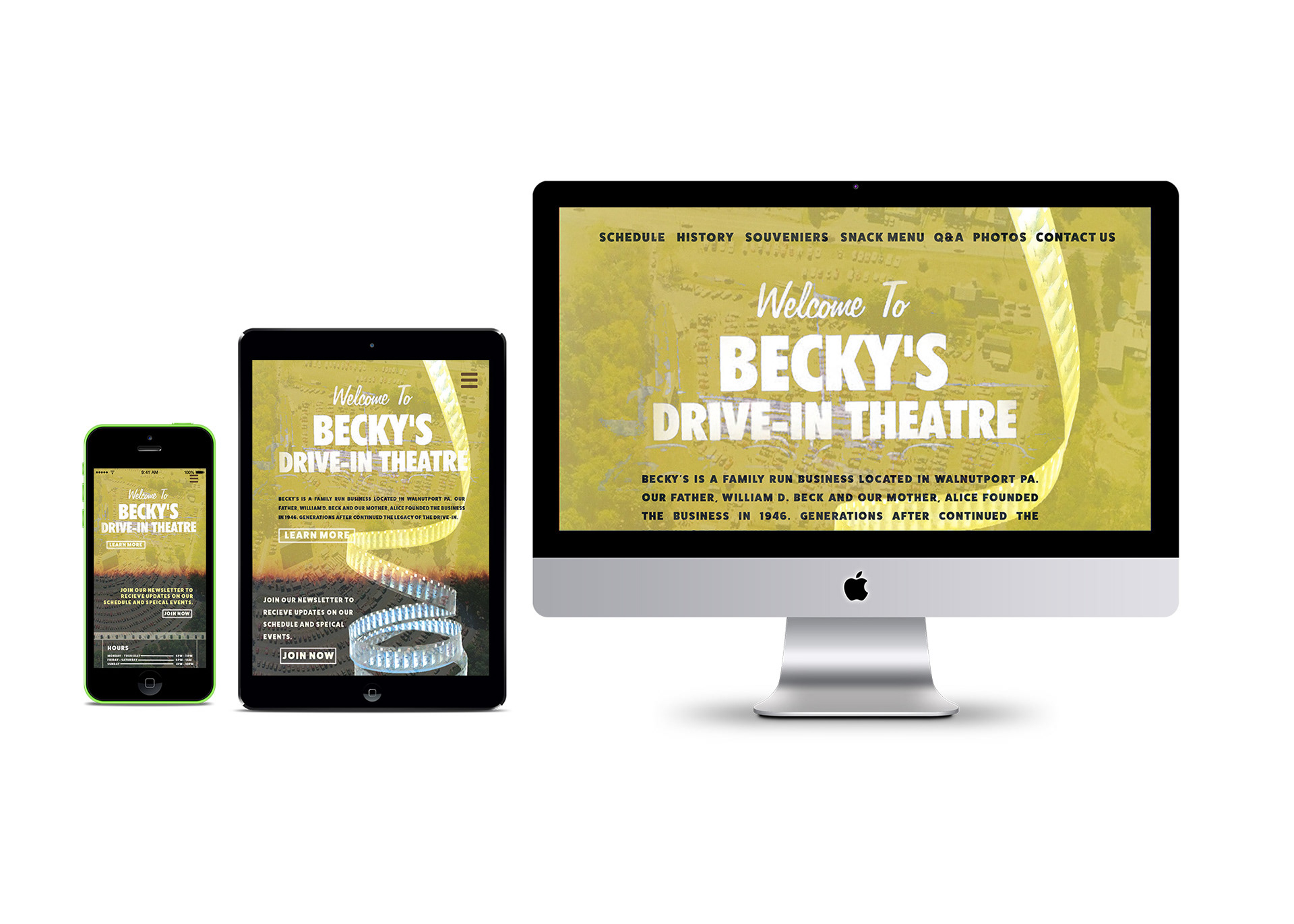
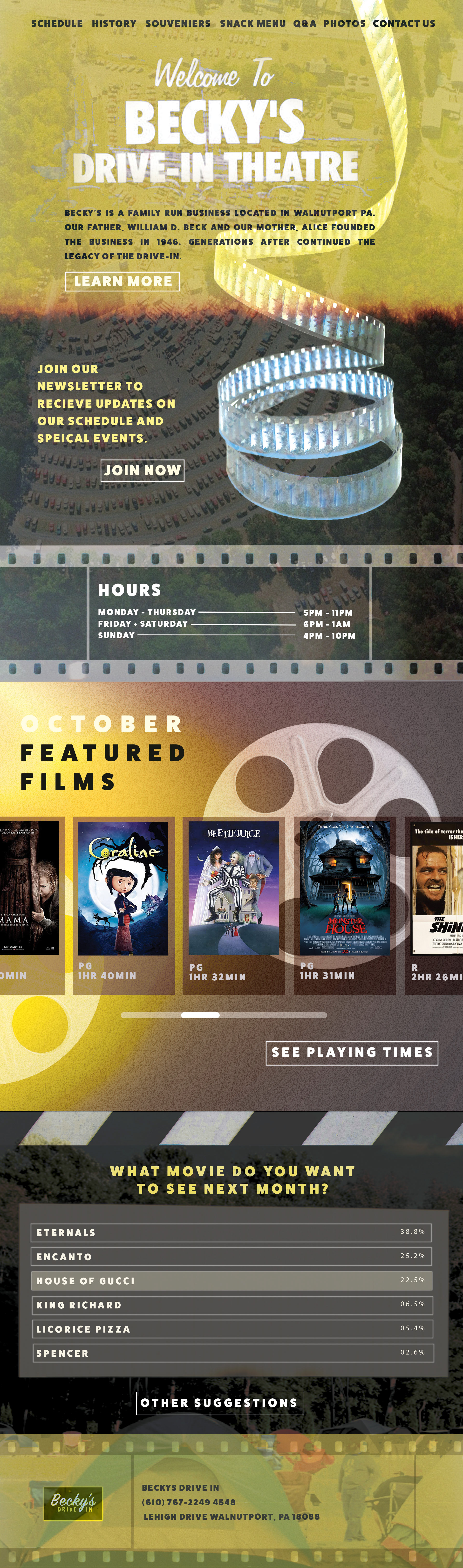
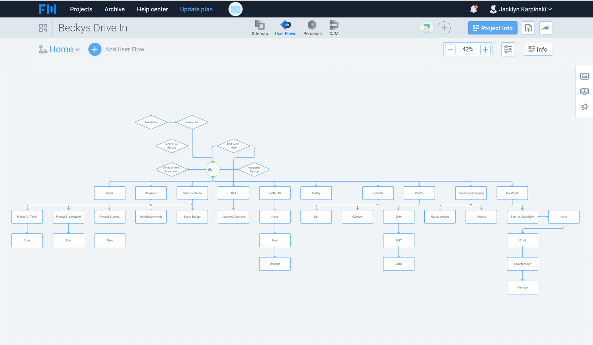
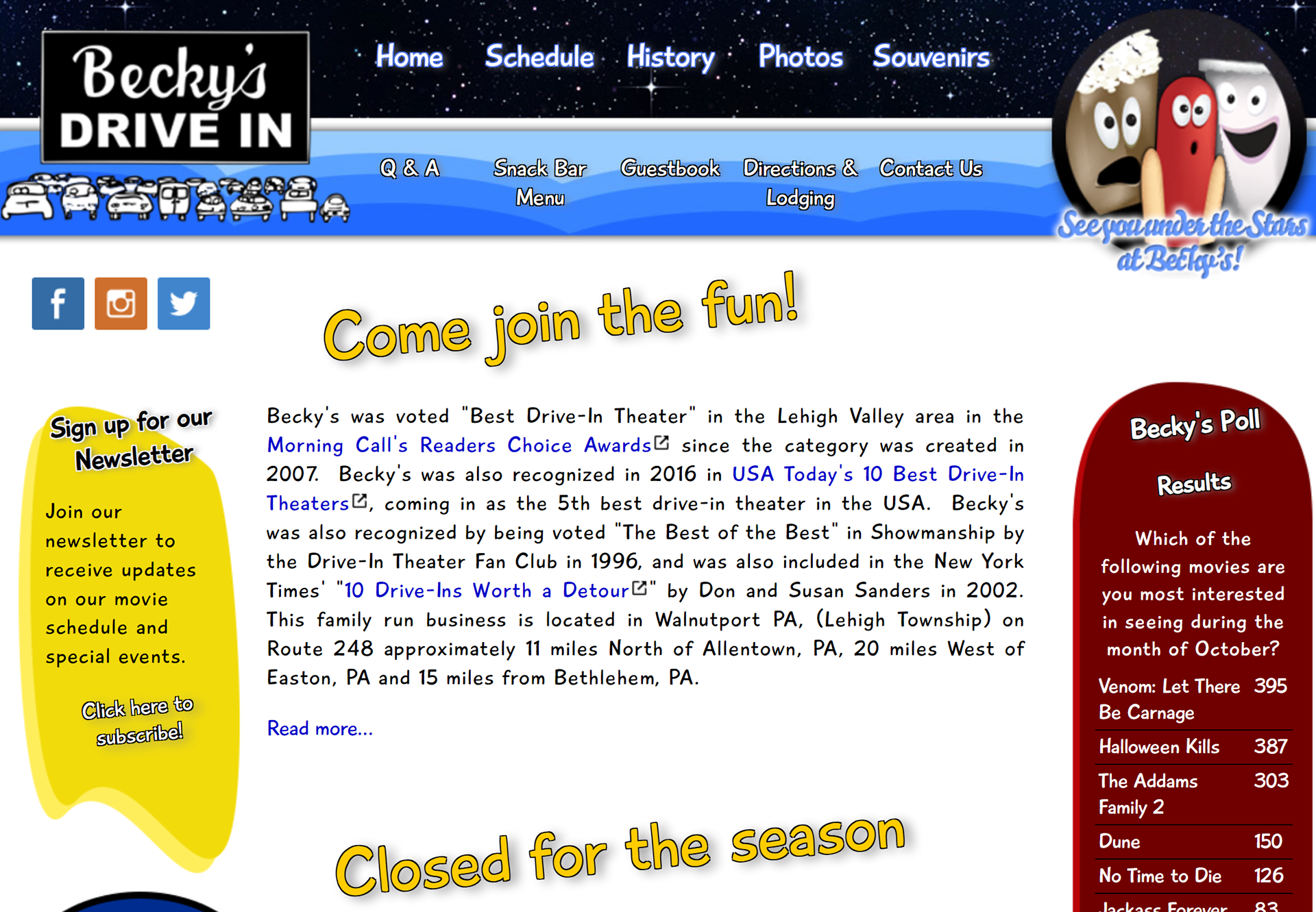
In my design I made the landing page cleaner and more professional. I added my own twist and style with design elements using layering yet keeping it to the point. It included everything the user needs. Instead of trying to squeeze everything on the home page, I spaced it out throughout the sections. The landing page contains the most important information like the show times, movies, newsletter, and learning more about how Becky’s drive in started, with link for all to learn more. This way the user is not bombarded with too much information but more graphics to grab their attention to stay on the page and find what they all need.
In my design I made the landing page cleaner and more professional. I added my own twist and style with design elements using layering yet keeping it to the point. It included everything the user needs. Instead of trying to squeeze everything on the home page, I spaced it out throughout the sections. The landing page contains the most important information like the show times, movies, newsletter, and learning more about how Becky’s drive in started, with link for all to learn more. This way the user is not bombarded with too much information but more graphics to grab their attention to stay on the page and find what they all need.